Enterprise Newsroom | UX Design
How site redesign transforms corporate articles into an award-winning enterprise Newsroom
Company Info
Fortune Global 50 Manufacturing Software Company — Enterprise | $5B+ revenue
Role
UX Research & Design
Team
1 Content Manager, 10 Software Developers
Duration
Incremental updates over 24 months
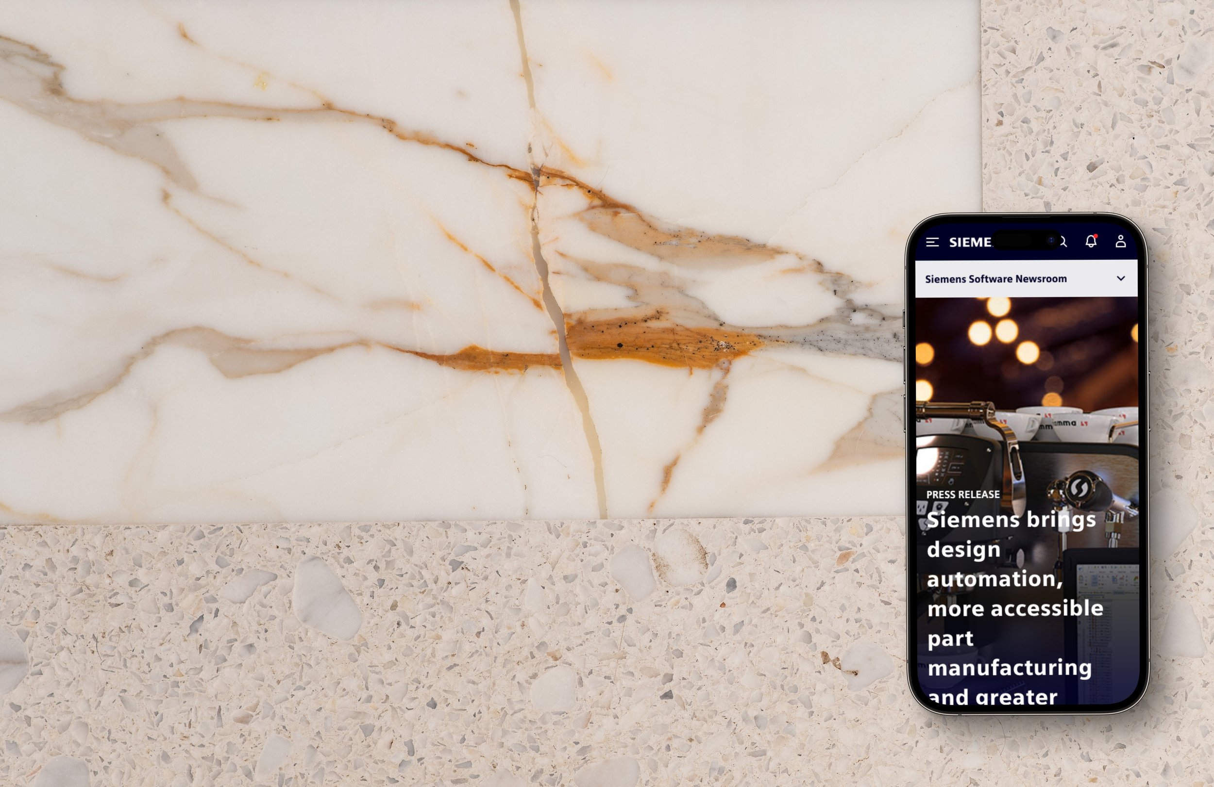
Phase 3 design of individual Press Release page with modern above-the-fold, high-resolution image, social share icons, embedded images, filter tags, and related reading.
Results / Impact
Awarded internal award for design work—Siemens Software HIT Award for exemplary collaboration and innovation, FY2023.
Increase in revenue and customer findability of company products to 45% from 30% in previous years; a 15% increase.
Project Overview
Modernizing the enterprise Newsroom and Press Release pages afforded press professionals quick access to important corporate updates that help them do their jobs faster and more efficiently.
Market Research
Competitive analysis revealed that other newsrooms were more contemporary user interfaces with full-bleed images and healthy use of white-space.

Competitive Audit (Mobile shown only) for Newsrooms including Autodesk, Altium, and Solid Edge, and one personal favourite, the New York Times.
Iterative Designs
Platform constraints suggested new components should be designed.
The Newsroom landing page was out-dated and high cognitive load. I sought to open up the layout so there was breathing room, and streamline what Newsroom customers truly wanted to see on the landing page. I started with paper prototypes (to focus on functionality over pixel-perfection), then iterated from low-fidelity wireframes to high-fidelity, interactive mockups that I delivered to Software Developers to implement.

Annotated paper prototype of the Newsroom landing page.

Paper prototype of the Newsroom Resources page.

Paper prototype of the Newsroom horizontal card component, an enhancement to the existing card component.

Low-to-medium-fidelity wireframes of the Newsroom landing page, the Home Page.
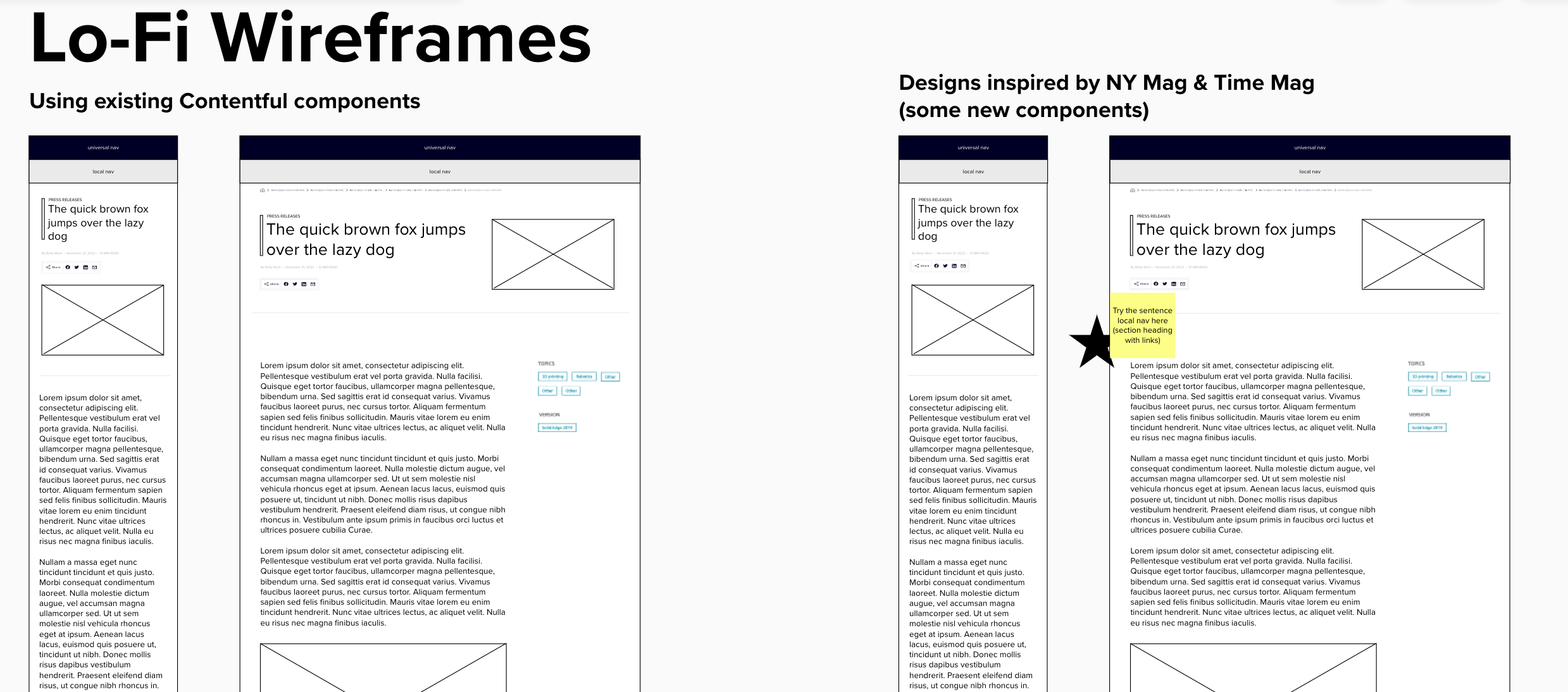
Low-to-medium-fidelity wireframes of the Newsroom individual Press Release pages. Phase 1, which included MVP and no high-resolution images or modern UI.

Medium-fidelity wireframe of the ideal-state of Newsroom's new individual Press Release pages; Phase 3.

Enhanced the Horizontal Card component to allow vertical stacking–rather than the previous constraints for only side-by-side & up to 3 cards only.

This allowed the Content Manager to add more of the highly relevant Press Releases and Customer Stories they wanted to showcase to customers.

Recognizing that a Social Media Feed component would bring the Newsroom into the 21st century, I designed mobile first as well as a desktop version.
Anatomy
-
A. Social media icon from our Iconography set. [required]
B. Feed container [required]
C. Social Media title [required]
Heading 1 (36px)
Includes only the name of social media platform
D. Account profile picture and name
E. Post text
F. Visual content
G. Reactions, comments, share
A short cut for our users to interact with our social media
Uses the corresponding social media icon from our Iconography set.
H. Scrollbar
Scrolling bar appears when user scrolls to see further down the feed.
J. Instagram media post
Shows seven most recent IG posts with video or image
Image - No indicator
Video – Play triangle in top right corner
Multiple images - Deck icon in top right corner
K. Next row of posts
For mobile and desktop (horizontal): Top ¼ peek
For desktop (vertical): Top 1/2 peek
L. See more (text button)
Scrolling allows user to view those previously loaded rows, but the container never expands
beyond default height.
M. See more (primary button)
When selected, the container expands to fit the next row of posts (and ¼ peek of the row after
that) until it gets max height of 785px (or 4.25 rows)
Once height is 4.25 rows, “See more” loads the next row and ¼ peek of the row after, pushing
the other already loaded rows up and out of visibility
Scrolling allows user to view those previously loaded rows, but the container never expands
beyond height of 785px.
N. See less
When selected, the container reduces to the default height (1.25 rows)
Desktop design of the Social Media Feed component for the Newsroom.
Phase 3 Designs
The Press Release Hero component had the biggest impact on the overall feel of the new Press Release pages.
In Phase 3, shown below, the hero component enhancement became a vibrant, full-bleed, high-resolution image with brand-compliant content, an enhanced Social Share component, and more streamlined article layout, with tags for filtering on the landing page.
Mobile version: Phase 3 design of individual Press Release page with modern above-the-fold, high-resolution image, social share icons, embedded images, filter tags, and related reading.
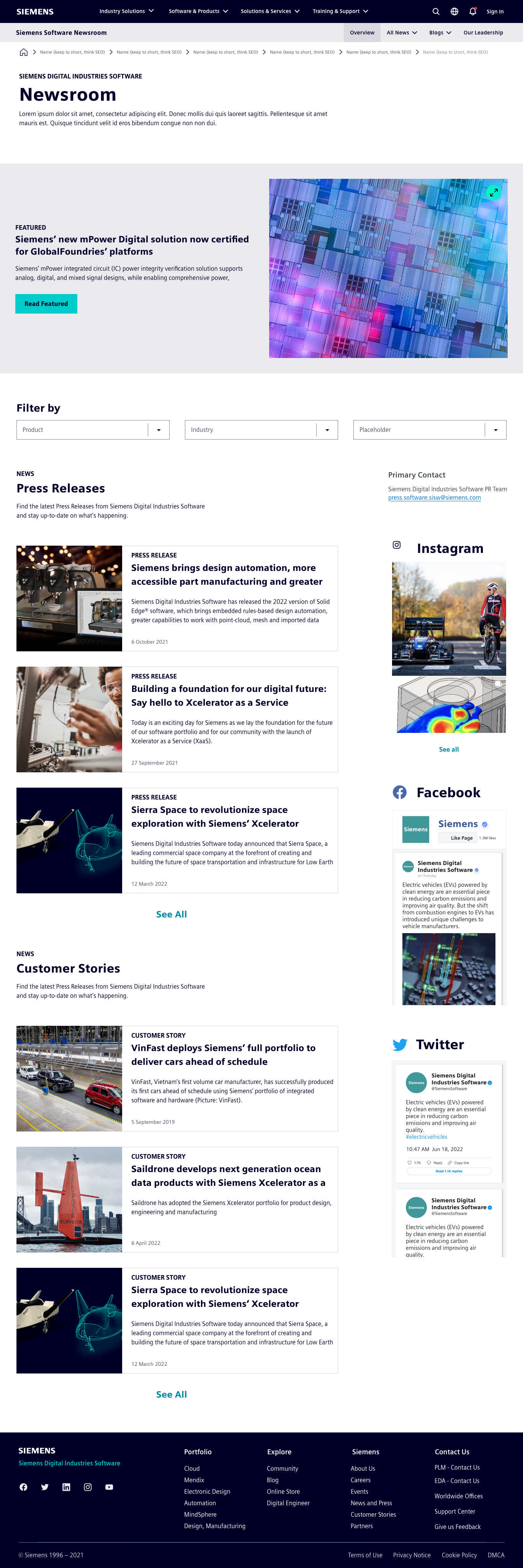
Phase 3 designs for the Newsroom Home Page, complete with filter component, social media feed component, and enhanced horizontal card component.

Phase 3 Newsroom individual Press Release page, including enhanced social media share component, article tags, and full-bleed, high-resolution image.

Original Newsroom Home Page.

Original design of the individual Press Release pages.
Results / Impact
Awarded internal award for design work—Siemens Software HIT Award for exemplary collaboration and innovation, FY2023.
Increase in revenue and customer findability of company products to 45% from 30% in previous years; a 15% increase.
Constraints & Limitations
What would I do differently?
For the duration of the 3+ year “Great Migration” (of the marketing site to a new platform), I was pulled in and out of redesign work, as the Developers found time and resources to implement design iterations. To better aid the Developers, I deconstructed the final designs into three phases.
Phase 1 included the landing page and Press Releases that only included titles, a low-resolution image (or no image at all), one of the enhanced components (the Horizontal Card), and a “Related Reading” section.
Phase 2 progressed a bit further along the path to the “modernization” I was tasked to provide, but halted due to resources being allocated elsewhere which never returned, leaving the redesign “good enough for now”, never to be revisited.
An internal award for Innovation was given to the team for our work on the Newsroom, which I feel may have miscommunicated unspoken permission to move on to other areas of import.
Phase 3 was never officially implemented.
If I had my “d’ruthers”, I would have loved to see Phase 3 to fruition, and validate the final designs with customers.